
My role
UX/UI Designer
Collaborators
Graphic Design: Zhan Shi
Web Developer: Sam Hart
Content editor: Ariana Samadpour
Designed for
IEH Laboratories and Consulting Group
Time frame
Nov 2021 - May 2022
Facilitate the production of safe, wholesome food.
IEH Laboratories & Consulting Group is a food safety company that provides testing and consulting services. They work with food companies to design, implement, and monitor food safety and quality systems. One of their commitments to customers is to provide accurate test results with short turnaround times.
As the lead UX/UI designer on this project, I redesigned the website by reorganizing its structure and updating its visual language. In this project, I work closely with the web developer as well as the graphic designer.

The Original IEH Website
Below is what the original IEH website looks like.

Original Website - Issues and Opportunities to Improve
The IEH website had a lot of information, including various testing and consulting services. The website had to be reorganized in a way that this abundance of information would not inhibit users’ experience on the site. Several issues I found are:
Testing service pages didn’t have a uniform layout
Consulting service pages didn’t have a uniform layout
The homepage had too much information
There was unnecessarily redundant information throughout the site
The footer didn’t add any valuable information
High-resolution stock images caused the site to lag
Competitive Analysis
IEH’s biggest competitors at the time were Eurofins and Mérieux NutriSciences. When I was a product designer at IEH, both Merieux and Eurofins’ websites look different from what they are now. However, some qualities from these two websites that IEH’s website was lacking were a clear categorization for testing services, an emphasis on upcoming webinars, customer testimonials, a highlight of blogs/articles on the home page, and a consistent UI page template for all pages of services they provide.

Eurofins’ home page

Mérieux NutriSciences’ service categorization
User Research
Due to limited time and the lack of a research team in the company, I wasn’t allowed to conduct further research. If I was given more time on this project, I would recruit IEH’s customers and internal employees to conduct semi-structured interviews with them to learn about their pain points when using the website. During the interviews, I would also observe participants navigating through the website and ask them to narrate their thoughts and actions.
Team Workflow and Challenges
Throughout the project, I collaborated closely with the web developer to implement my designs. I consulted regularly with the microbiologist/content editor(Ariana) to finalize content changes, and I occasionally worked with our graphic designer on icons and banners.

One challenge I faced during this project was needing to reorganize the highly-specialized scientific content of the site without a background in biology. To ensure that the new design made sense and was scientifically accurate, I worked closely with a microbiologist at the company.
Another challenge I dealt with throughout the project was the limited functionality of WordPress. Because the company was committed to using the WordPress platform, I had to check with the web developer to make sure the designs I had in mind would be implementable on WordPress. Often, there was a back and forth between designing and redesigning due to a roadblock on WordPress.
Wireframes and High-Fidelity Prototype
I started the design process with wireframes. After they were approved by Ariana, I designed the high-fidelity prototypes with Zhan’s (graphic designer) help. Below are some side-by-side comparisons of the wireframes and high-fidelity prototypes.

Home page wireframe

Home page high-fidelity prototype

Products page wireframe

Products page high-fidelity prototype
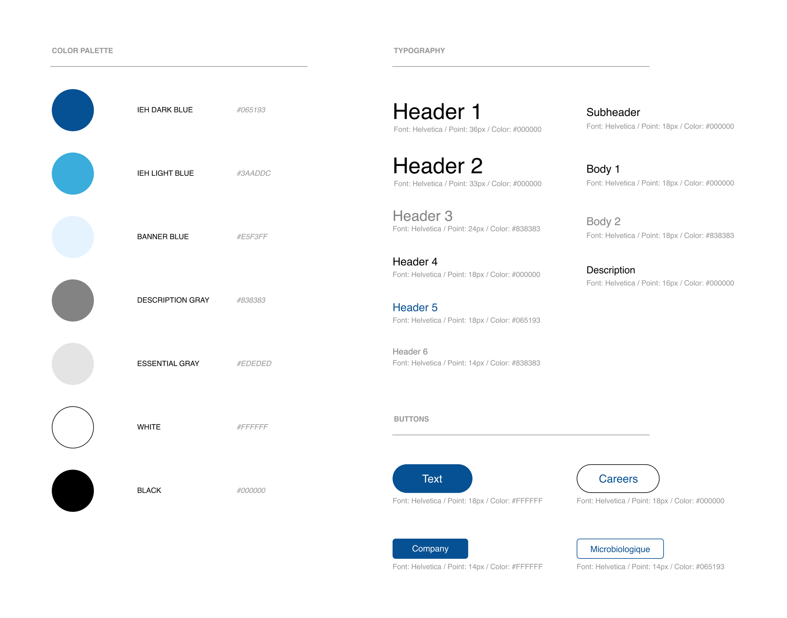
Style Guide
Keeping the original IEH colors (dark and light blue), we added in a few more colors and finalized on fonts and button styles.
High-fidelity Prototype
Below are some of the high-fidelity prototypes that I designed. To see the entire project, please visit https://www.iehinc.com/.

Home page

Products page

Crisis prevention page
Usability Testing
I was assigned to take over IEH’s social media content shortly after the high-fidelity design was completed. I didn’t get a chance to conduct usability testing and get user feedback. If there was more time, I would come up with 4 tasks and ask the participants that I recruited to complete the tasks while navigating the website. The 4 tasks would be:
Send IEH a pet food testing submission form.
Contact IEH about crisis management and recall support.
Purchase Weber Scientific’s allergen test kits through IEH’s website.
Find IEH’s educational website, IEH Academy, and sign up for a webinar.
Improvements and Impacts
Several improvements of the redesign are:
Consistency across all testing and consulting service pages
Information is easy to understand using bullet points, icons, and images
Website speed improved immensely due to fewer stock images and more icons
Improved SEO as the website appeared on the first page of Google when searching “food testing”
A cohesive visual design language with recurring patterns: shades of blue, circles, and swirls
As the company’s first-hired user experience designer, the company saw the value of UX design and has been hiring UX designers since I left the team. I also introduced Figma to the marketing team, who have used Figma as a tool for meetings and designs. The redesign of the website has caused an increase in direct visitors by over 20%.
Reflection
What went well:
I was able to collaborate cross-functionally to get the redesign approved and implemented
Having a clear workflow sped up the design process
I learned that too many images hurt site performance and found an effective replacement (icons)
Opportunities for improvements:
If I had more resources and time, I would conduct more research before starting the design process to understand more about users’ pain points
I could conduct more in-depth usability tests with subsidiary companies instead of just asking for the feedback through messaging
I wish I had involved cross-functional partners more deeply in the design process using accessible, collaborative brainstorming tools like FigJam.